Koodo Brand refresh
AGENCY: CAMP JEFFERSON
ROLE: DESIGN DIRECTOR
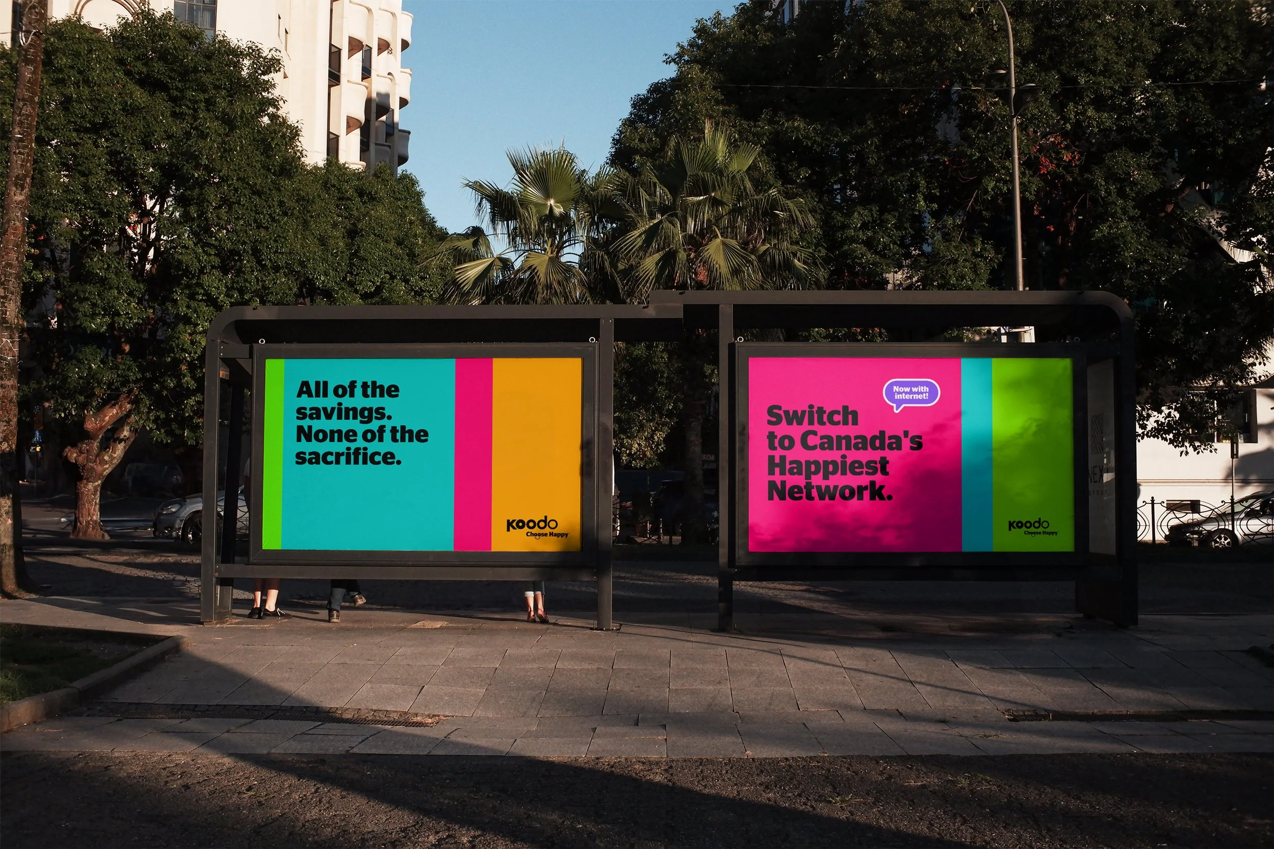
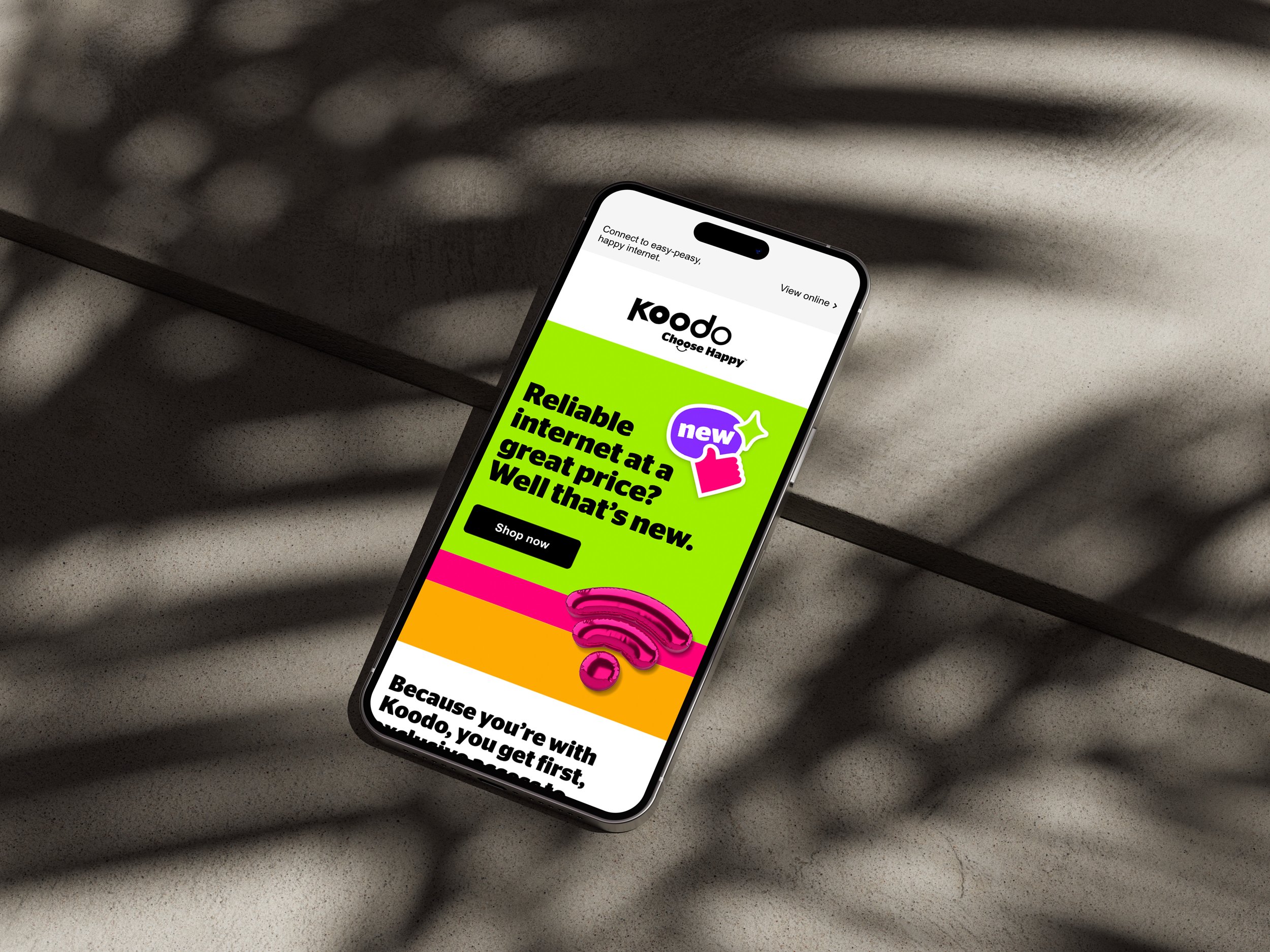
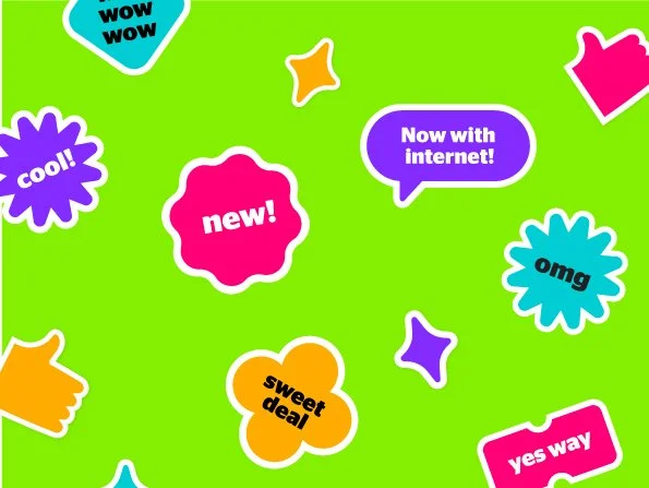
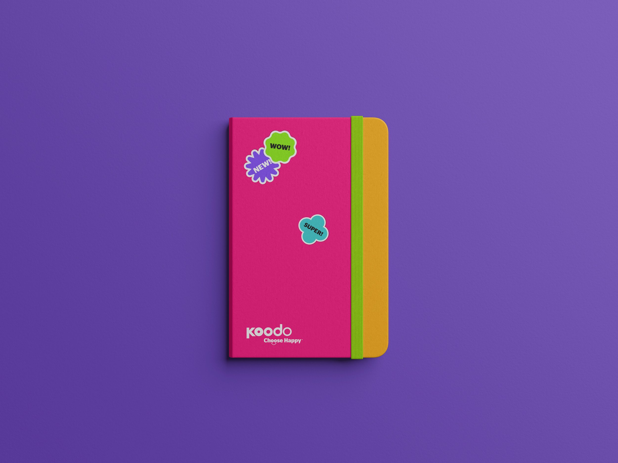
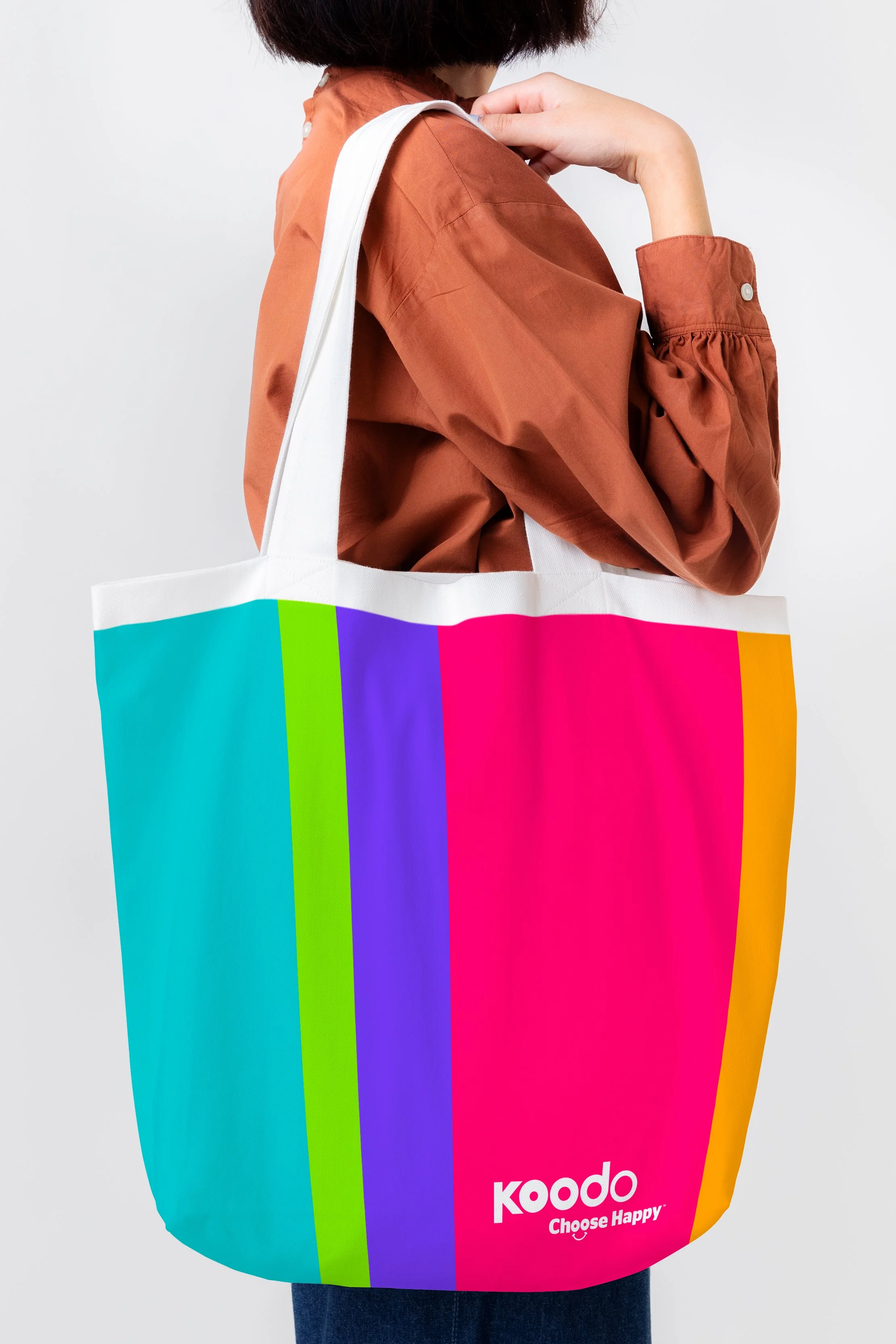
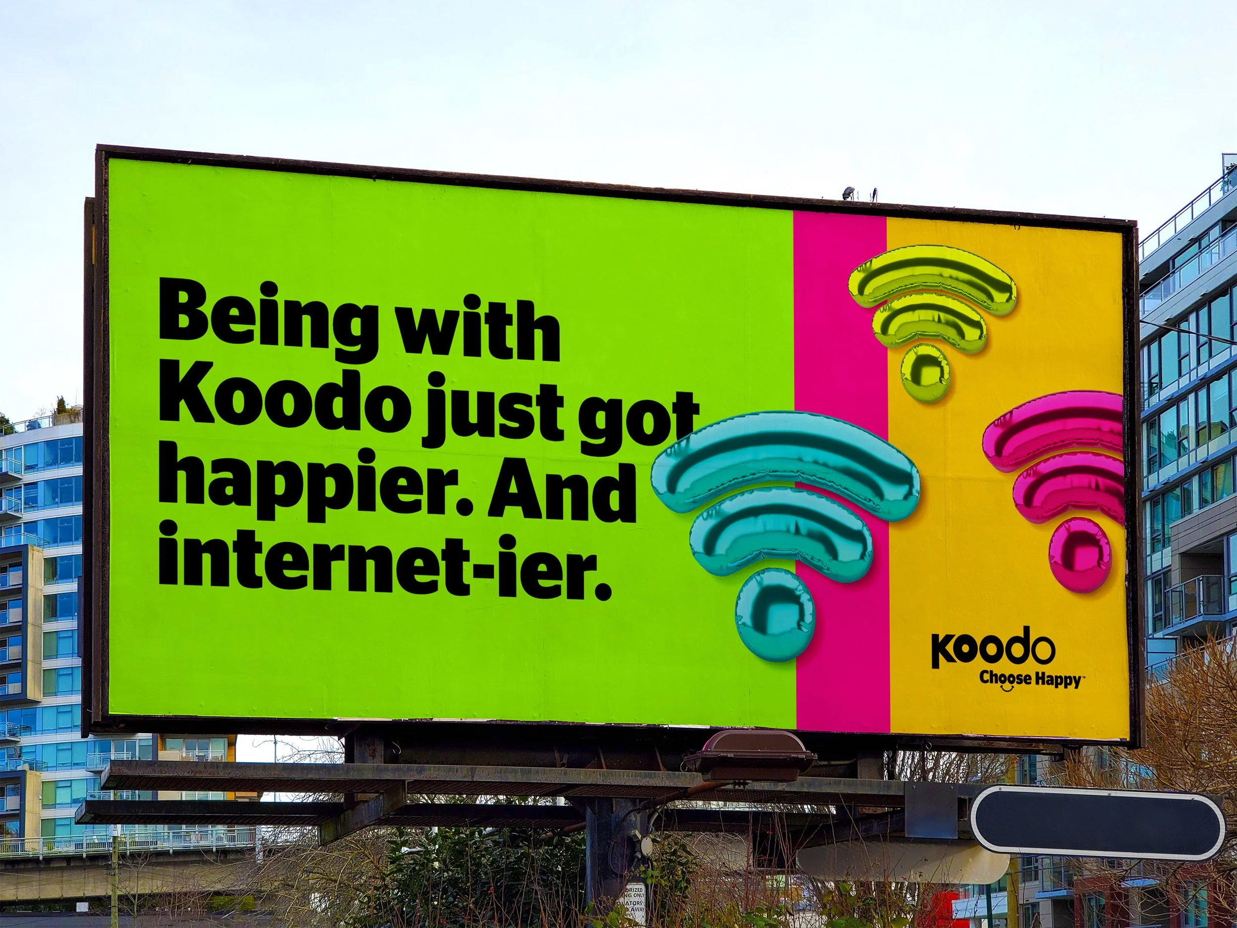
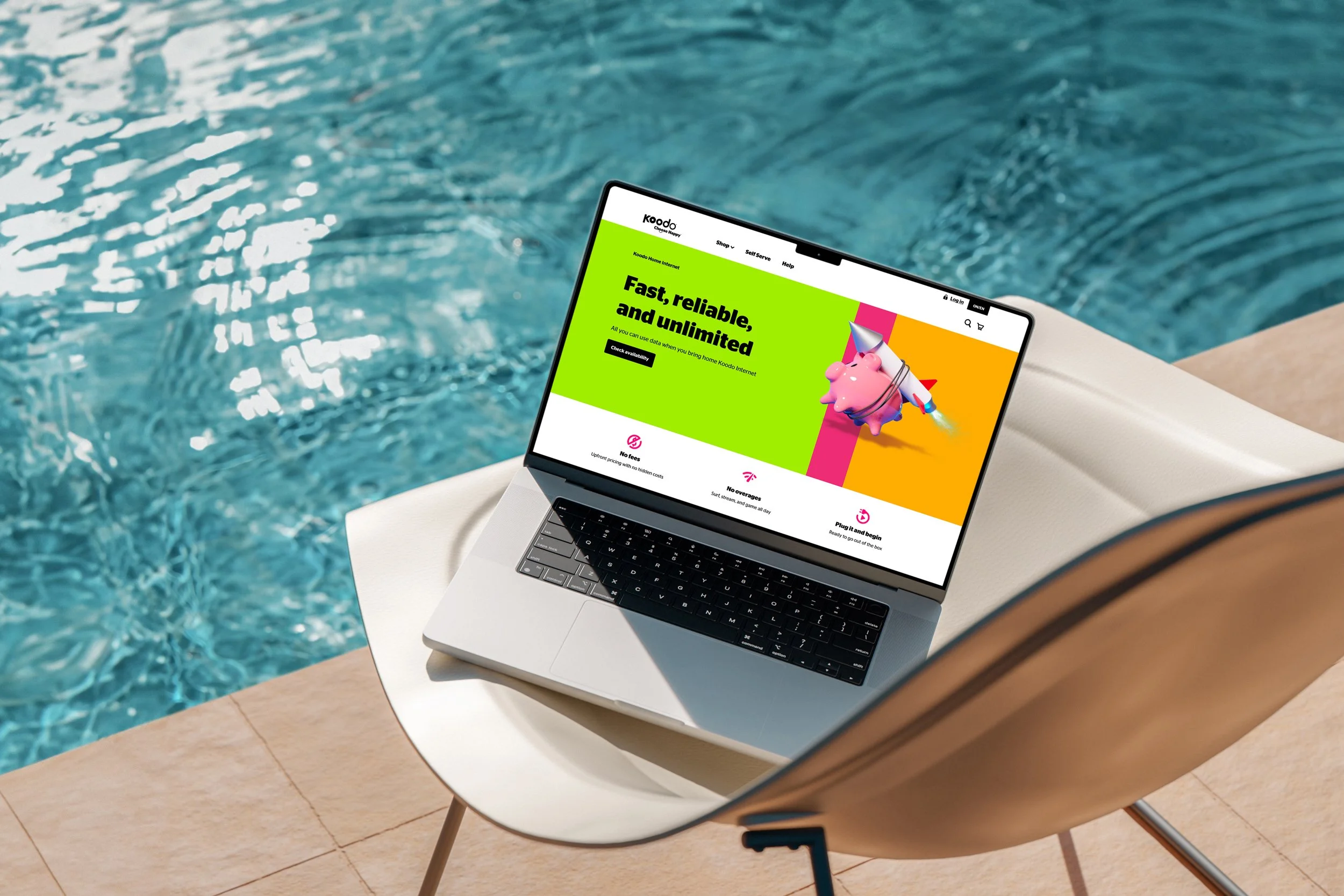
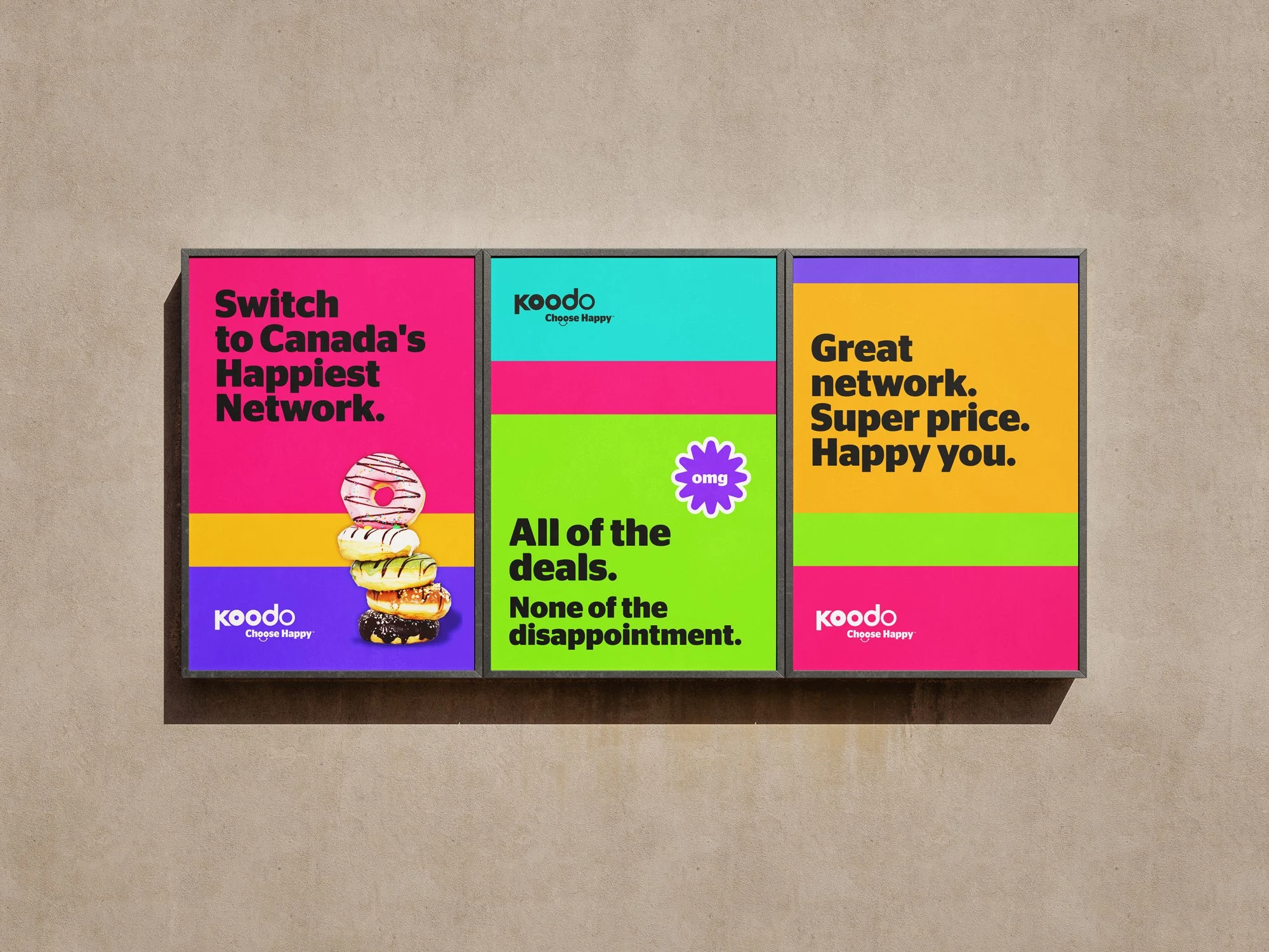
Telco is a crowded, low-trust category. Koodo's answer has always been to be the fun one — and this refresh leaned hard into that. Built around vibrant colour blocking, bold sans-serif type, and a modular grid that scales from a phone screen to a twin-panel street installation, the system was designed to stop people in their tracks. Loud on purpose. Choose Happy, turned up.