Light life &
Field Roast Packaging rebrand
AGENCY: JACKMAN
ROLE: SENIOR DESIGNER
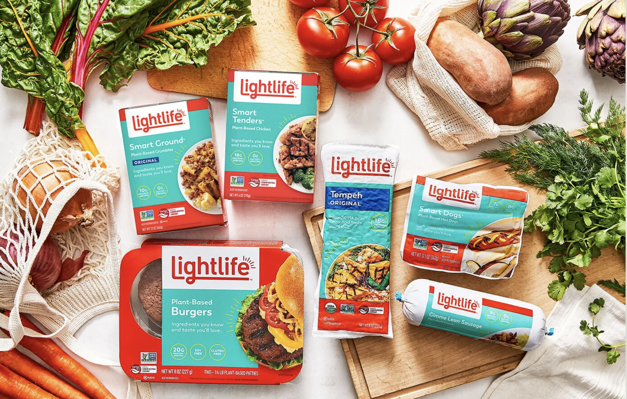
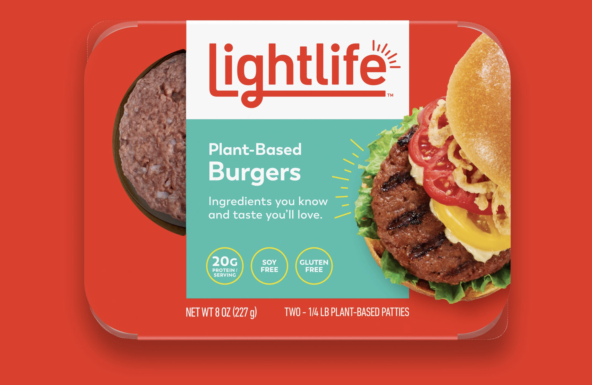
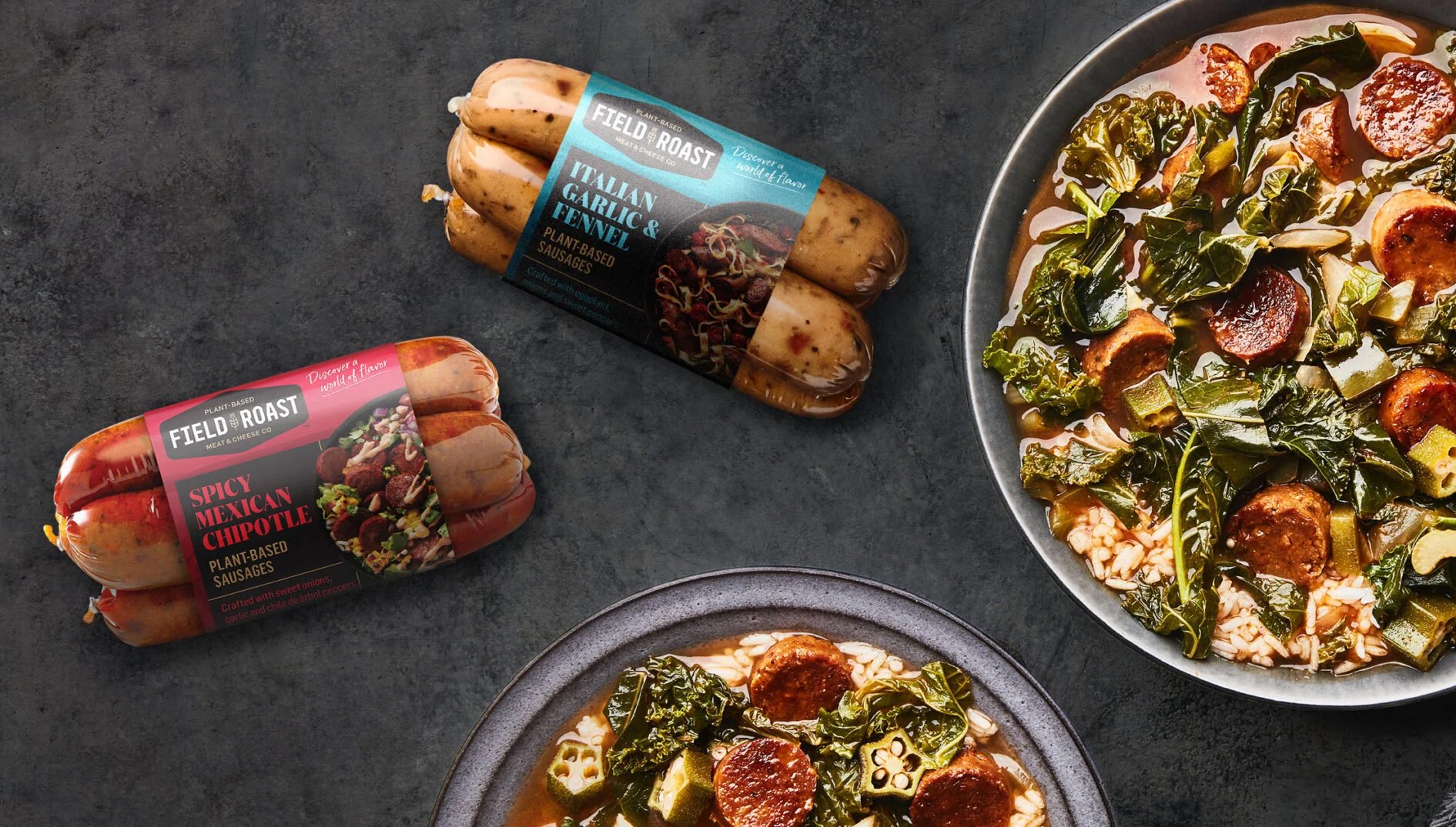
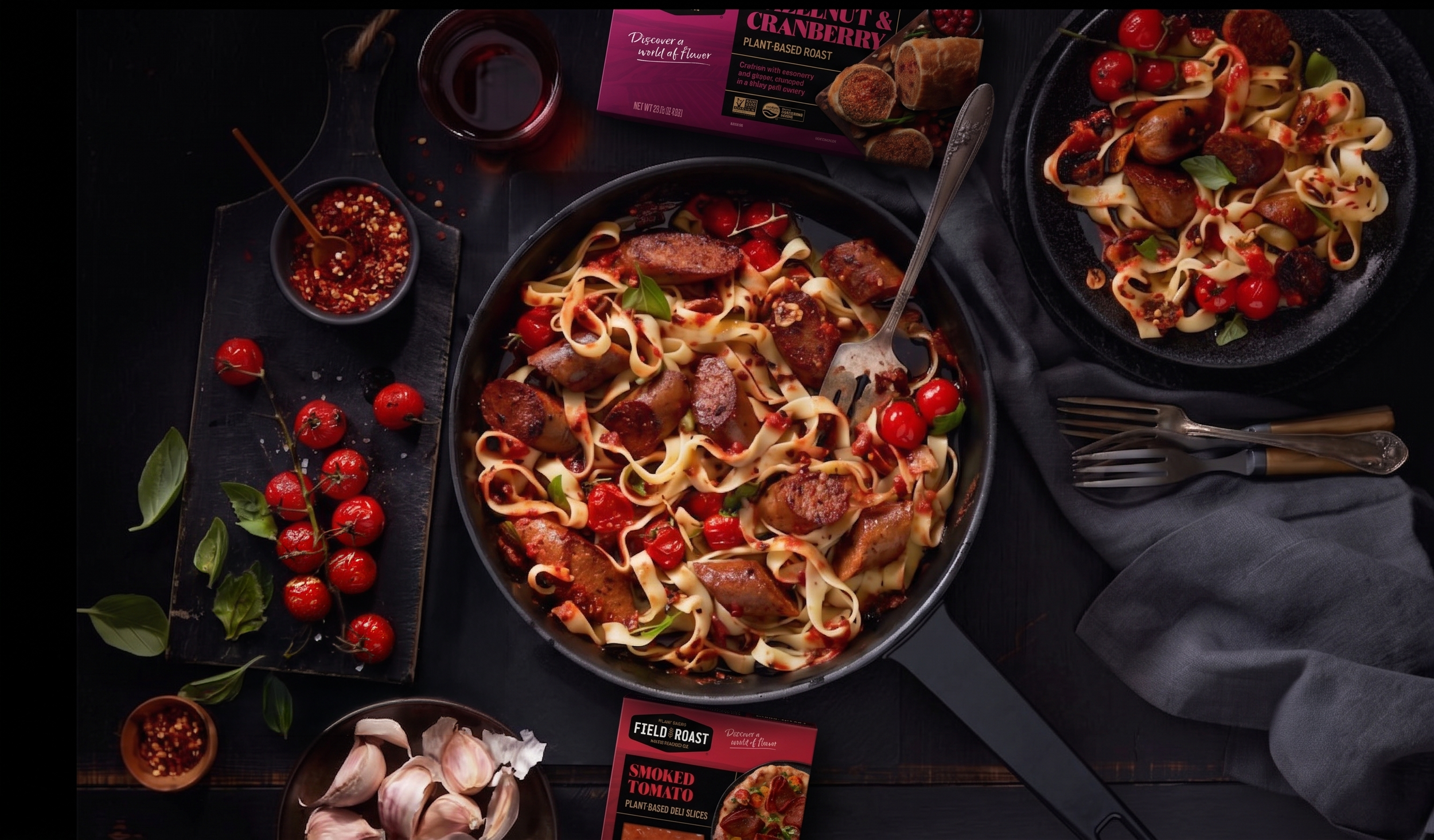
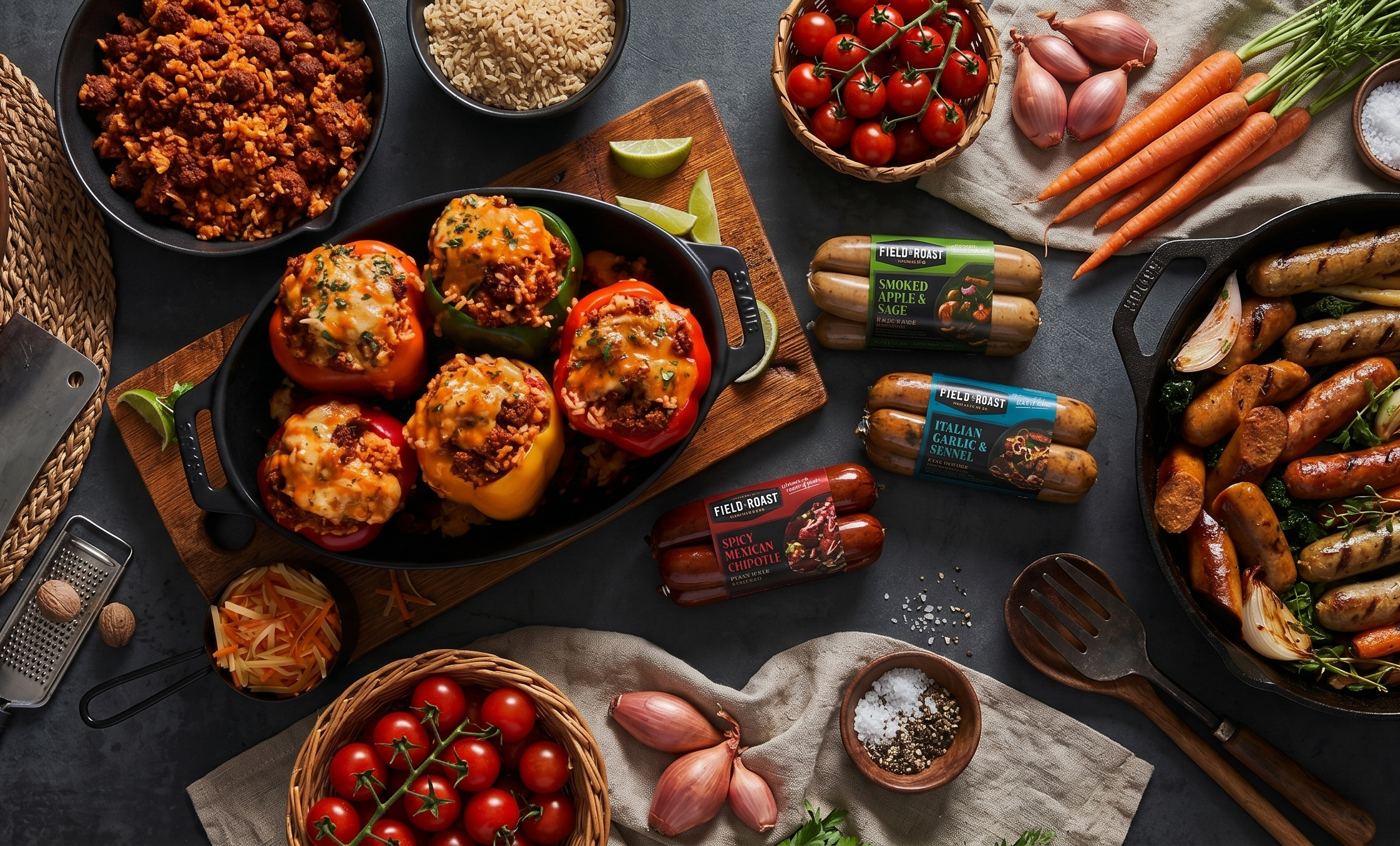
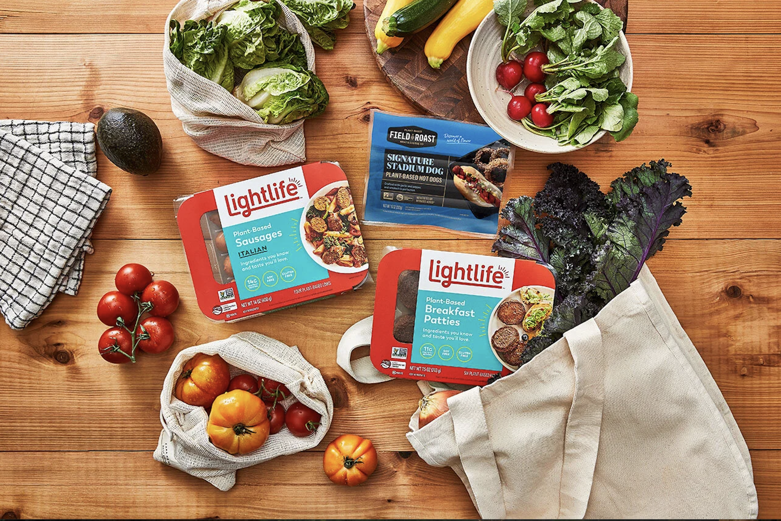
Lightlife and Field Roast, both under Green Leaf Foods (a subsidiary of Maple Leaf Foods), produce high-quality plant-based meat and cheese alternatives. Maple Leaf's challenge was threefold: modernize packaging that had fallen behind a fast-moving category, create clear visual differentiation between two brands living under the same parent, and win on shelf in a space growing more crowded by the season.
The solution required two distinct identities built from a shared strategic foundation. Field Roast leaned into a bold, craft-forward identity rooted in ingredient provenance, speaking to a more discerning, quality-driven shopper. Lightlife went bright and accessible, designed for mainstream grocery appeal and everyday approachability.
Executing across roughly 60 SKUs demanded rigorous system thinking. Every design decision, from colour coding to flavour callouts to photography style, had to hold consistently across formats and retail environments while still reading clearly and distinctly at the shelf edge.